Pancakes & French Fries: Before & After
Jules was one of the very first blogs I stumbled upon before I even had a blog. Since one click lead to another and another, by the end of the week I had completely forgotten the URL for her blog. Once I had my own blog set up and went through clicking on one blog after another I found Jules again. Yay! I hope you enjoy her writing style as much as I do.
xo,
Camila
_________________________________________________________
Hello! My name is Jules and I author the blog Pancakes and French Fries, a blog about life (sweet and savory) as an ex-attorney turned suburban stay at home mom. In other words, you probably don't know me from Adam. I don't write about design except to point out how hard I think design bloggers work, which is something I realized after spending two days trying to cobble together a simple mood board. Never again.
Of course, I'm not all thumbs when it comes to design. Thanks to a Google reader full of creative and inspiring design blogs, I have been able to pull off a room or two (literally. two.) in my home that don't look atrocious. The room Camila asked me to talk to you about today is my kitchen.
Don't be alarmed. That's the before.
My husband and I have always dreamed of buying a fixer-upper and making it ours. We love everything about older homes, down to the bizarre things you find inside the walls. When we bought the house we are in now (a 1958 red brick ranch in southern California) I was practicing as an attorney. Financially, things were good.
So we bought this house and set our eyes on the kitchen. We picked out nice finishes (that we could afford) and set to work. We had one small hiccup. In the middle of the remodel I quit my job to become a stay at home mom. (I talk more about that here, if you are curious.) It's a decision I have never regretted, but it did put a crimp in the budget. We still had the cabinets, flooring, windows, appliances, and back splash to do (an entire kitchen!) and the items we picked before wouldn't work with our new budget. And, since everything was already demoed, there was no turning back, either.
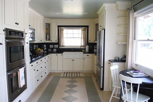
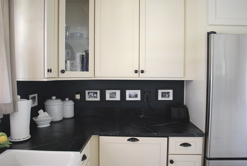
After.
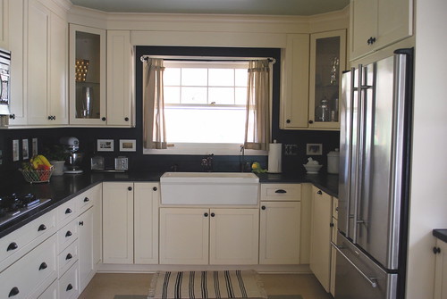
I spent over a week researching cabinets and found a vendor online for cabinets that cost 1/4 of what we were going to spend before. I'd share the vendor but they went out of business last year. It was about the cost of IKEA cabinets. Installation was as much as the cabinets, so if you can DIY this part you will save a considerable amount and open your budget to things like, oh, flooring.
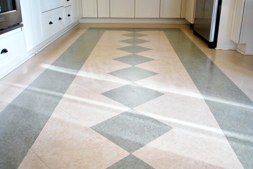
My flooring? VCT tile, the same floors you walk on at Target, Walmart, and the supermarket. The kitchen and laundry room cost about $100, installed. (I decided to forgo the shiny finish that makes clean up easier. We just don't get as much foot traffic as Walmart.)
The back splash we held off on for almost four years. It had to be very inexpensive, but something I would enjoy. If I have learned anything in the last four years, it's that buying (or DIYing) something just because it's inexpensive and fills up space costs more in the long run. It's better to just wait until inspiration (or money) hits you.
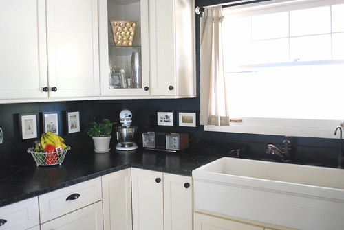
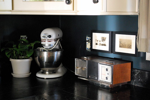
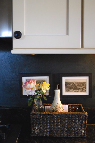
For me, inspiration hit while my husband was on a business trip. I have boxes and boxes of old family pictures collecting dust. One day I was thumbing through them when I realized that I was, potentially, looking at my future back splash. I went to Home Depot, bought a quart of my favorite Ralph Lauren paint in Polo Green, 10 IKEA Ribba frames, and got to work.
In one day I had what I think is a beautiful back splash that celebrates family and history, all for less than $50.
There is still much to do. The windows, trim, window treatments, baseboards...the list is endless. But, I have learned that we have time. I have also learned a valuable lesson in all this.
When we bought the house and started the renovation, we wanted the best of everything. I pored over design magazines (I had no idea blogs existed back then) and took note of what was the latest and greatest. This was going to be the best! kitchen! ever! Our biggest ticket item, purchased before I quit, was our soapstone counters. We probably spent more on that than the rest of the kitchen! And you know what everyone notices first? You know what everyone cites as their favorite part of our kitchen?
The $100 floor and the $50 back splash.
And that's what I love about High Heeled Foot in the Door. Camila proves day in and day out that you don't need bags of money to create a room worth living in.
Have a wonderful trip with your family, Camila! ¡Que te vaya bien!
Labels: before and after, guest blogger


16 Comments:
cute! i love pancakes & frenchfries :)
Ha. You almost got me with the "before" photo.
Great reno. And I love your frugal philosophy. The handmade and the original has something that money can't buy.
It looks so high-end. I can totally relate to having to modify you budget when you decide to stay home. I did the same thing four years ago. It must be very satisfying to have such a great finished product knowing that you did the bulk of the work yourself.
I love the after.
Awesome kitchen... and I love the after photos - the palette is neutral and very sophisticated...
XOXOX
Kiki
This before-after is amazing!
I love the wall decor, how the black countertop and black walls make the pictures and decorations POP!
This is so inspiring :) Thank You!!
Goes to show with some thought, even walmart flooring can look smashing.
(And love the meld today of two blogs I love!)
gorgeous! i love it.
love your post! really great kitchen & mix of "high/low" as designers say. i really can't tell what is high/low at all! since budget is always an issue w/me, it is great to hear what people have responded to when they've seen your kitchen.
One of the most beautiful kitchens I have ever seen :)
Jules, you rock xxx
Thanks, everyone. :) I was nervous about doing a guest post here because I am many things, but a designer is NOT one of them.
Leah--no one, besides the occasional (online only) designer or design and decor buff has ever made a comment about my soapstone counters. It's always the back splash and floors. It used to bother me since they were SO expensive and we debated on getting them for so long but, now that my budget is consistently low, it's very satisfying to know I don't need loads of money for my home to look nice and feel welcoming.
OK, I think I need to get some of that VCT for my next house- who would have known such a pretty pattern could come out of them- I just LOVE it!
Jules,
What a fabulous makeover!! It really came together even though the budget changed. Beautiful!
Wow! You did an amazing job!
The floor was a great solution on a budget! I will admit, as soon as I saw those counters, I said "If that girl got that for next to nothing- she is my hero" I think having that soapstone brings it all up to another level. I totally agree with you- don't just do something cheap to do it- wait and get it right. Lovely job!
www.vintagescout.com
Absolutely brilliant transformation! That kitchen is gorgeous and I love the story behind it. Thanks so much for the inspiration!
Post a Comment
Subscribe to Post Comments [Atom]
<< Home